






Three years ago, I put together a “Moocher Index” that measured the degree to which non-poor people in a state were benefiting from redistribution programs.
As you can see if you click on the nearby table, Vermont was the worst state, followed by Mississippi, Maine, New York, and Massachusetts.
I confessed that my Moocher Index was a crude and imprecise tool, but it was one of my most popular posts in the early days of this blog. Probably because it was a way of measuring the degree to which people were being lured to ride in the wagon of government dependency (a very disturbing trend put in visual form by these two cartoons).
So I was very interested when I found that somebody at Forbes did something vaguely similar and came up with a list of “death spiral” states.
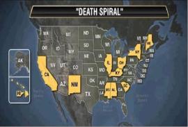
Eleven states make our list of danger spots for investors. They can look forward to a rising tax burden, deteriorating state finances and an exodus of employers. The list includes California, New York, Illinois and Ohio, along with some smaller states like New Mexico and Hawaii. …Two factors determine whether a state makes this elite list of fiscal hellholes. The first is whether it has more takers than makers. A taker is someone who draws money from the government, as an employee, pensioner or welfare recipient. A maker is someone gainfully employed in the private sector. …what happens when these needy types outnumber the providers? Taxes get too high. Prosperous citizens decamp. Employers decamp. That just makes matters worse for the taxpayers left behind. Let’s say you are a software entrepreneur with 100 on your payroll. If you stay in San Francisco, your crew will support 139 takers. In Texas, they would support only 82. Austin looks very attractive. Ranked on the taker/maker ratio, our 11 death spiral states range from New Mexico, with 1.53 takers for every maker, down to Ohio, with a 1-to-1 ratio. …The second element in the death spiral list is a scorecard of state credit-worthiness done by Conning & Co., a money manager… Its formula downgrades states for large debts, an uncompetitive business climate, weak home prices and bad trends in employment. …A state qualifies for the Forbes death spiral list if its taker/maker ratio exceeds 1.0 and it resides in the bottom half of Conning’s ranking. It’s easy to see how California got on our list. It has pampered a large army of civil servants while using every imaginable trick to chase private-sector jobs away, the latest being a quixotic scheme to reduce the globe’s atmospheric carbon.
Not surprisingly, there is considerable overlap between the top states in the Moocher Index and the death-spiral states.
So be forewarned. If you live in California, Hawaii, Maine, Mississippi, or New York, it’s quite likely that you are surrounded by people who want you to work harder and pay higher taxes so they can get more handouts.
Heck, that’s true in most states, so you should worry regardless of where you live. Click here to see a very depressing chart about the nationwide increase in dependency.
So what lessons can we learn? Well, if you look at this map, you’ll notice that none of the states without an income tax are death-spiral states.
And if you look at this map, you’ll see that there’s no overlap between death-spiral states and states with the lowest tax burdens.
Hmmm…sort of makes one think that maybe higher taxes aren’t the right way to solve a fiscal mess. Maybe somebody should inform the President.
Last but not least, here’s a map showing the state-by-state generosity of welfare benefits. I don’t detect any correlation with death-spiral states – except for New York and California.
If you live in either of those two states, you may want to escape before it’s too late.



Join the Conversation
VIP members get the ability to comment on articles.